
Design principles have been around for a very long time and understanding them is crucial to learning graphic design.
So how do we define design principles?
Design principles are a set of time-proven guidelines that humans have put together through trial and error for understanding how to represent the world.
They serve as a map to arrange visual materials (shapes, colors, lines, etc.) in the best way possible, according to a specific intention, strategy, or objective.
When you look at other design principles definitions on the web, you’ll notice that most only give a you a list of principles, but never go to explain what these principles really are as a whole.
An understanding of design principles is the most important aspect of learning to apply them later in real design work.
In this post, I explain in detail what design principles are and mean for graphic design and give you specific examples of how these principles are applied in design.
Get Your Free Guide
Design Fundamentals for AI Creators
Learn how to use AI tools like a creative director, not just a prompt writer.
Discover the essential design principles that make your AI-generated visuals look professional, balanced, and brand-ready.

Design Principles Are a Set of Guidelines
You can view the principles of design as a set of guiding rules about what works and does not work in the arrangement of visual raw materials.
When I say “visual raw materials”, I mean the different “parts” that make up all the things that we see.
For instance:
All that we see will be composed of many different elements, such as lines, textures, colors, shapes, and shadows. We call these “raw materials” of visual reality elements of design.
These “rules” we call principles do not necessarily work like laws and don’t have to be taken literally. In fact, each principle always works in relation to one another.
Our objective as designers is to represent objects, feelings, ideas, or concepts through graphic design.
Once we learn to perceive the different elements of design, we are able to arrange those elements in certain ways to produce effective representations.
In addition, design principles are not just “human-made” constructs, but a set of time-proven truisms (self-evident truths) about how the world arranges itself visually and how we perceive it.
These principles are the human description (or codification) of how the natural world is presented to us visually.
They are constant observations about what works visually.
Design Principles Never Work Alone
Design principles can be rearranged or combined. They never work in isolation.
But here’s the thing:
There are different ways of arranging visual content in an effective way.
That’s why they are called are principles and not laws, and we follow them because others before us have mastered and perfected these observations through trial, error, and experimentation.
That is:
Design principles are time-proven guidelines for the best ways and methods for organizing visual elements strategically in order to communicate effectively.
Design principles have been developed over time and that is why they are principles.
Simply put, they are ways of organization.
They organize visual information and provide different alternatives for arranging that information, depending on our communication objectives.
Nature Can Teach You a Lot About Design Principles
We can learn about design principles from nature. We can observe how visual things are arranged in nature and how and why it works.
Take the trunk of a tree. What do we see? It has a special construction, visually speaking.
Trunks have different colors, different shades. They have texture. These are all things that we can appreciate visually.
Now, how is this texture patterned? How is color used and distributed?
It’s as if nature knows how to arrange all these elements in beautiful ways!
This is exactly the idea behind design principles:
They are the knowledge that guides you in using visual materials and using them to design beautifully and effectively.
Texture will be displayed in a pattern. It will have color, but those colors will have different shades that will communicate different things.
For example:
Does a surface look rough, smooth, glossy? These are all things we can appreciate visually.

Design Principles in Everyday Life
We can apply these examples from nature to the images and graphics we see every day.
A poster in the street will have some information displayed but it will be arranged in a strategic way. By changing the size of letters, we know that a heading that is bigger and bolder is more important.
Changing the size of font serves to structure information.
We use design principles to arrange letters on a paragraph in such a way that it becomes not only readable but pleasant to read. These are design principles at work.
Here’s an example:
A logo will use shapes and lines and color to represent something about a brand.
We use those shapes and colors and lines in a strategic way in order to communicate specifically what we want to communicate.
These are design principles at work that help you arrange visual elements in a strategic manner.
Examples of Design Principles
Like I said, in this post we will not go into detail about specific design principles, but I want to show you some examples of principles and, specially, how they work.
Take the design principle of hierarchy:
We can use hierarchy to guide our reader to the information we want to highlight and to structure that information.
Headings are great simple example of how we use hierarchy. Imagine we had a book with no headings, no bold letters, no changes in font size.
We wouldn’t really know what to read or how to read it: we would be overwhelmed by all that information.
How readable is the following example:

When we use headings as a form of hierarchy, we are actually structuring information. We are telling the reader what is important what what is less important.
This is a design principle at work.
Another design principle is unity:
Unity as a principle can tell us that elements that are close together have a stronger or closer relationship that elements that are farther apart.
It can be used in different ways:
We can have elements that are positioned tightly together, or very separated through space. Being close represents kinship or unity.
Or we could have elements that are the same shape, color, or size. This also represents unity.
The closer elements are, in space or appearance, the stronger the bond or stronger relationship they communicate.
We can see hierarchy and unity working together in real life.
Take a website, for instance. Web designers will use headings of different sizes and colors to structure information and guide your eye in a specific way.
What about a button to a call to action?
It’s usually red, big, and bold. This is hierarchy at work.
So now you see how design principles actually help you organize visual information.
The more you understand design principles, the more you can apply them to anything you design, like logos websites posters business cards.
This is why it’s really important to understand and study design principles, but the most important thing is for you to practice applying these principles.
This is the bottom line:
What differentiates design from something that is not designed are design principles.
For example:
Often we will go walking down the street and we will see a wall or bulletin board filled with DIY ads searching for a dog or announcing a garage sale.
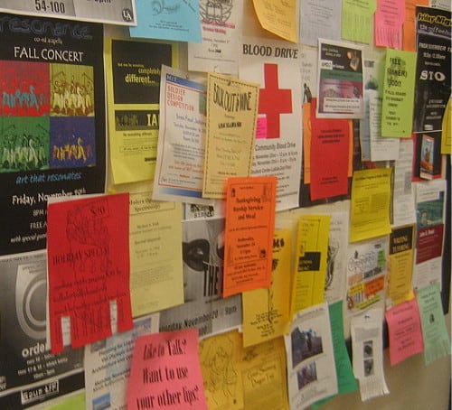
Most of those ads will have their information displayed without design principles. Most of them will be ugly and not effective at communicating information.
They will not stand out in a wall filled with the same types of ads. They will look amateurish.
Now, we can take the same ad and the same information and apply some design principles to them.
That’s why graphic designers exist: they know how to make information look awesome and effectively convey a message.
Conclusion: Start Learning Design Principles Right Now
Learning design principles, and applying them, are one the most important steps in learning graphic design.
Furthermore, it is the key to becoming a graphic designer.
The great thing about design principles is that they can be learned and they can be practiced.
Therefore, the more you study and understand design principles, the more you observe how they are applied in your everyday surroundings, the more you will understand and be able to apply them.
Without design principles, we will most likely create work that is uninteresting, unappealing and, worse, unable to communicate effectively.
These are the main points to remember:
- Designers must learn to “see” the “visual prime material” or perceive the visual features of things for what they are, not for what we “know” about them.
- The elements of design are the very raw materials of our perception of things. Visual things are made up of visual elements.
- Design principles are time-proven observations about how the world is visually arranged all around us.
- Design principles serve as a blueprint for arranging visual elements in strategic, effective ways.
Do you already know some design principles? Which do you think are the most important? Leave a comment below and let me know what you think!
Free eBook
Design Fundamentals for AI Creators


About the Author:
Ruben Ramirez teaches digital media in college and started Self-Made Designer to share his knowledge of graphic design. He is also a self-taught designer.